Born in Bulacan, Philippines, Manuel Rubio, affectionately known as Manny, has cultivated a profound connection to the world of art through his uncle, the esteemed painter Mauro “Malang” Santos. His artistic journey began in Malang’s studio, where he honed his skills during his fine arts studies. After a successful eight-year tenure in a Manila design studio, Manny transitioned to Hong Kong, becoming the art director for Asian Finance and later immersing himself in the dynamic realm of weekly journalism with Asiaweek and Window.
Now the design director for The Asset, Asia’s premier finance magazine, Manny’s artistic endeavors remain deeply intertwined with his professional life. As a member of Haraya, a collective of Filipino artists in Hong Kong, he explores the intricate relationship between humanity and nature.
Clear and Present Danger
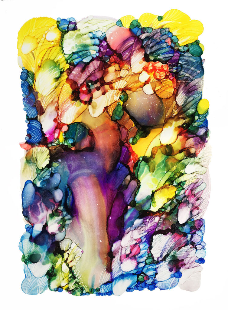
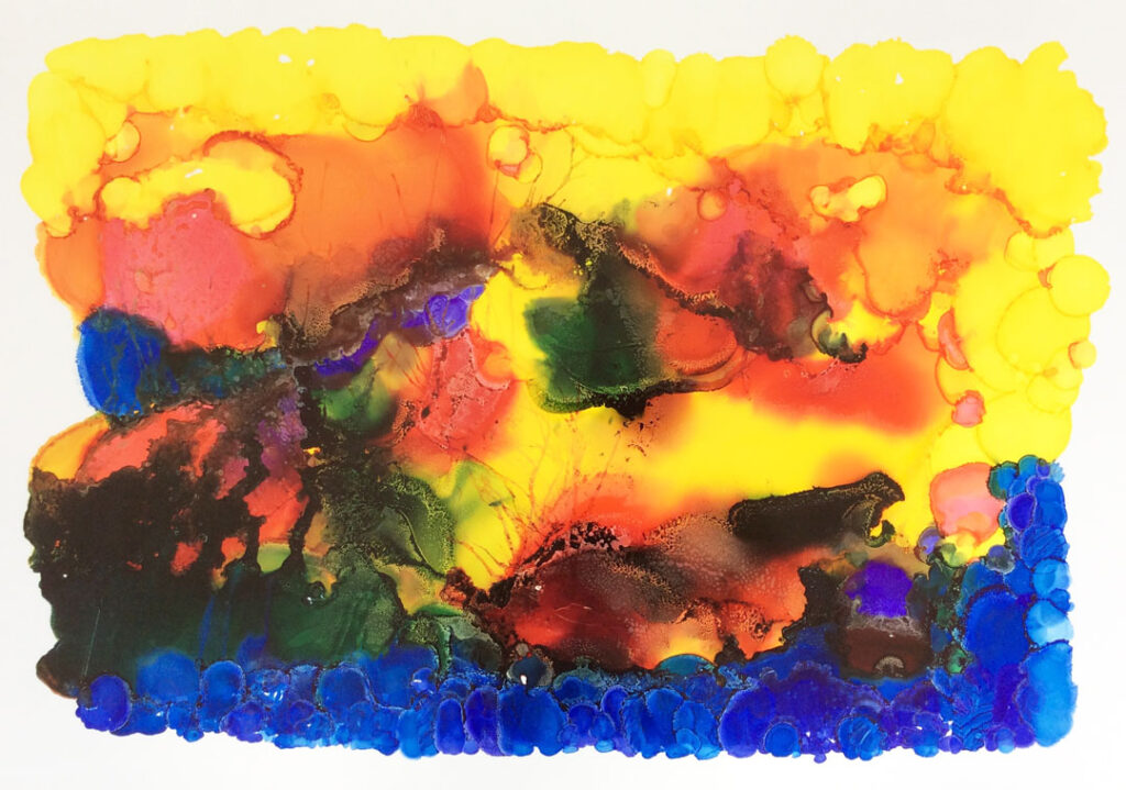
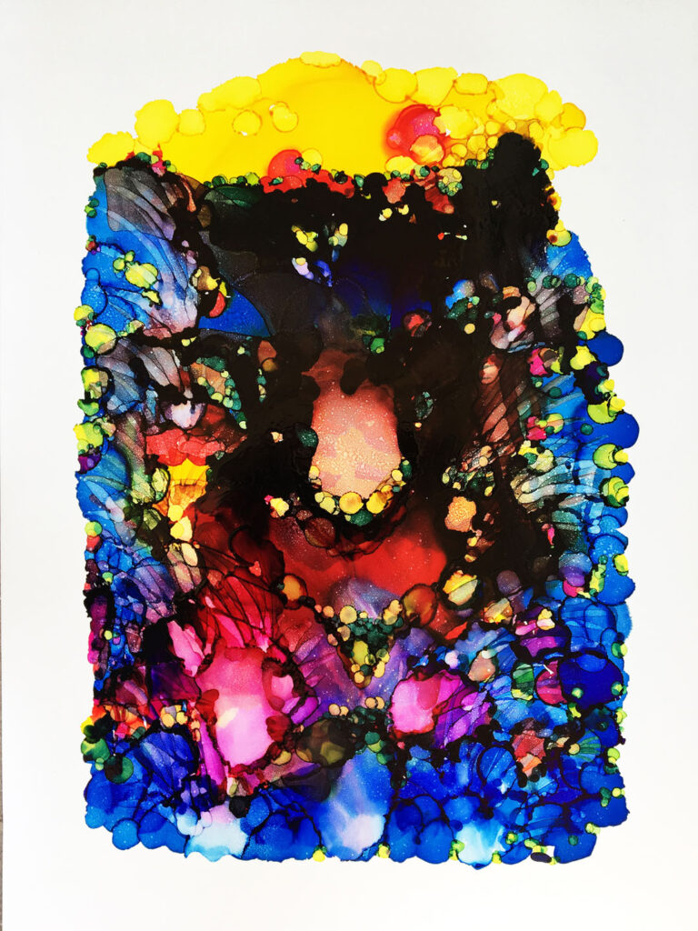
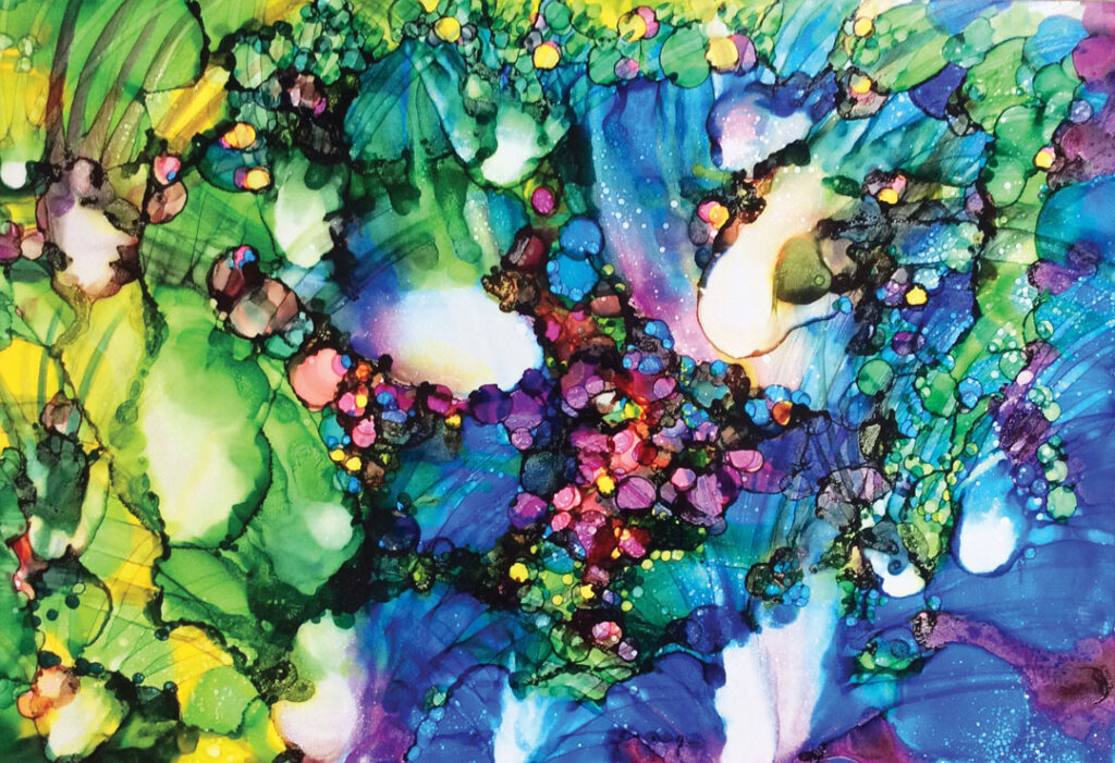
His latest series, Clear and Present Danger, confronts the urgent issue of global warming through vibrant depictions of marine life. Created using colored ink on Yupo paper, Manny’s works showcase the fluidity of ink and the textures achieved through innovative application techniques. Each piece serves as a metaphor for the beauty and fragility of our environment, inviting viewers to reflect on their impact.
Manny believes that “modest but sincere contributions could spell a great difference” in preserving our planet. His art is a journey of discovery, where shapes and colors come alive, revealing the ever-changing seasons of nature and evoking a sense of hope amidst adversity.
An eye-opening series of art works that focuses on one of the most meaningful and undeniable subjects that impact our daily lives – shedding light on issues concerning global warming. The paintings depicting marine life lead viewers to admire the beauty of the undersea paradise which could hopefully be the last less spoilt frontier.
These paintings were created using colored ink on yupo paper. Yupo paper is non-porous so the ink flows freely across the surface and allows for quite a bit of manipulation before the ink dries. The interesting textures were created using a variety of application techniques including adding drops of ink, letting the ink drip down the paper and applying ink directly with a brush.
The blending of nature into shapes and lines converge in a sea of emotions. A shape appears first as a reflection then drifts into volumetric configurations. All at once, it captures a sense of nature with movement and light creating an artistic metaphor both opaque and airy.
I pour ink onto the paper and anticipate what happens next, visualizing the movement of the forms and work through the mix and interaction of the colors. It is not a vigorous brushstroke that massages the paper, but a calm, soothing application in a more subtle way – this allows for more creative freedom.
In many ways, this series is the result of great experimentation. The theme of my work would be the changing of the seasons, or rather, witnessing the changes around my environment and seeing that come to life through my work. Shapes are anchors that our minds stop to reflect on. I use a subtle or intense interaction of colors to create depth and space in the piece. There is a lot of discovery as I paint and I intuitively render the shapes I produce as either happy accidents or intentionally as the final touches to my art piece.
The artwork (“Finding Nemo (xvii)”) below is currently on display at the “Unity in Diversity: Filipino Artists Across Borders” exhibition at Hong Kong Visual Arts Centre, February 26, 2025 through March 3, 2025.